
Connection
Focus: Brand Identity, Storytelling, Post Growth
Software: Adobe Illustrator, Photoshop, InDesign
Team: In Collaboration with Leah Da Costa, Eva Toon & Holly Ryan.
How Can We Reimagine the Smartphone in a Post-Growth, Fossil-Free Future?
The Challenge
Our first second year project at AUB challenged us to reconsider an assigned object, in our case a smartphone, in a world without fossil fuels, imagining a “society that has moved beyond the current economic growth paradigm towards a more desirable, post-growth future”.
My Process
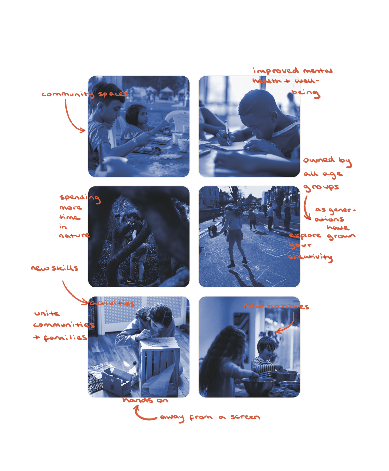
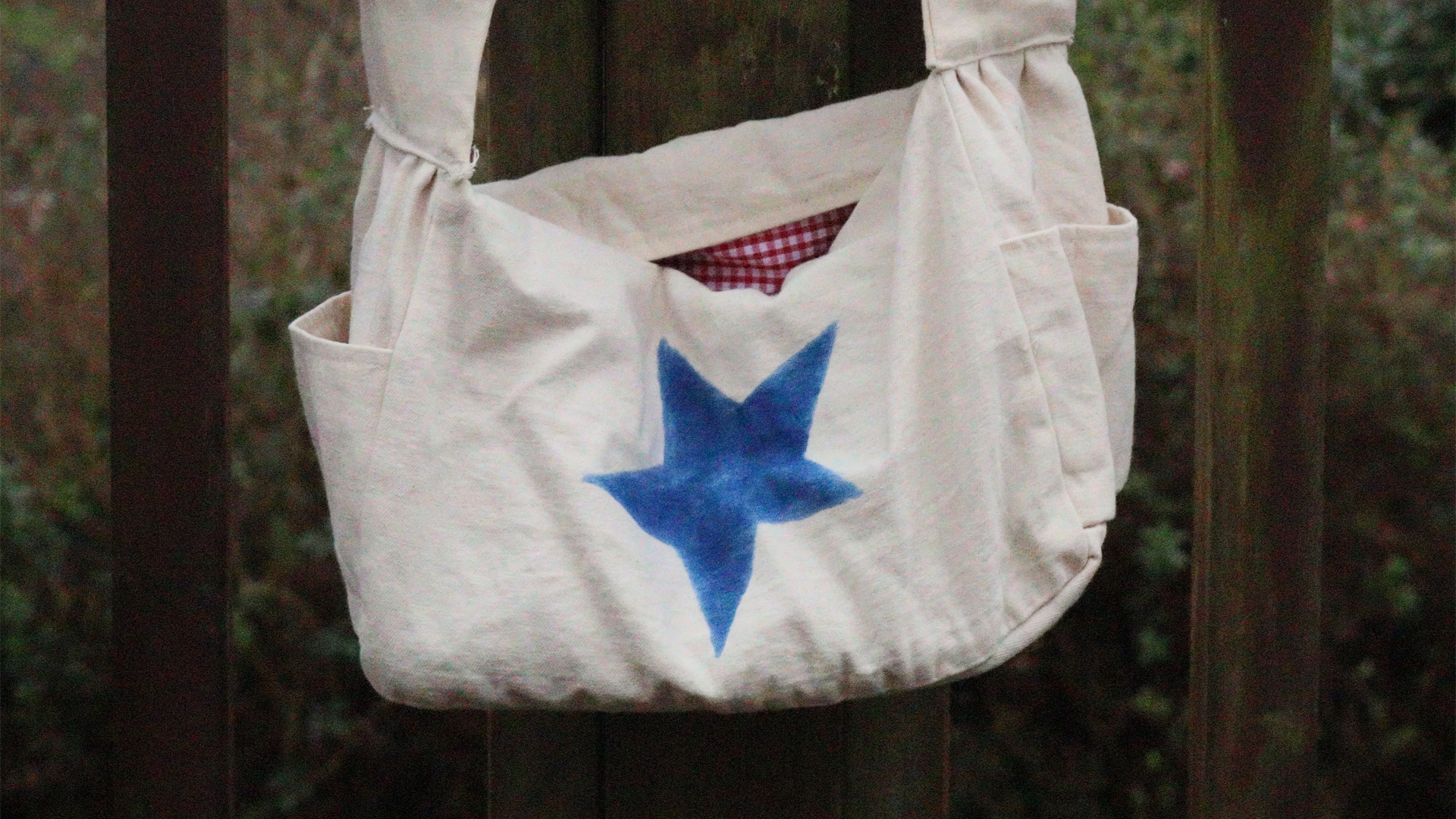
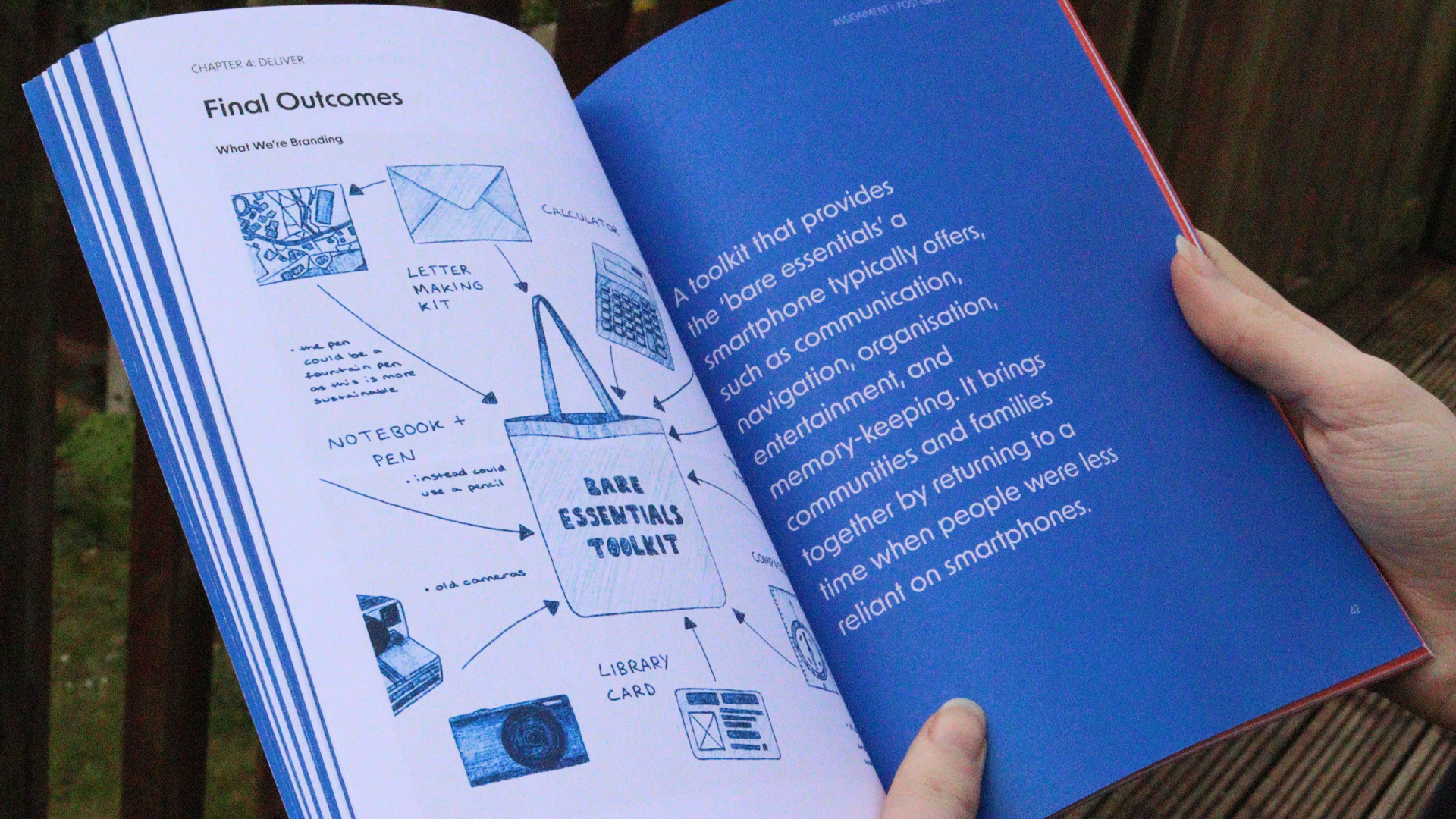
Collaborating with 3 of my fellow students, we created a brand that produces a toolkit of the ‘bare essentials’ typically offered by a smartphone, such as communication, navigation, organisation, entertainment and memory-keeping. Our aim was to bring communities and families together by returning to a time when people were less reliant on smartphones.
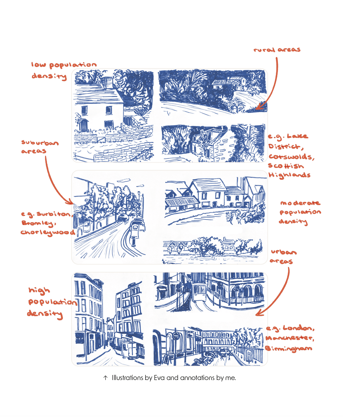
Target Audience
The main challenge we faced was presenting our concept as if it was already in place, our idea initially targeted 11-year-olds in England who were beginning to travel to school independently. “Our product is now owned by all age groups as generations have grown up. We aimed to unite communities and families by returning to a time when people were less reliant on smartphones, encouraging time in nature, new skills, and active hobbies.”
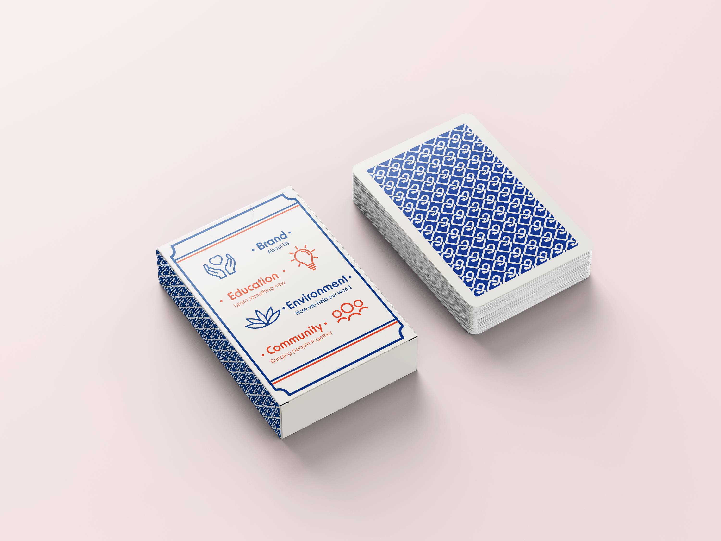
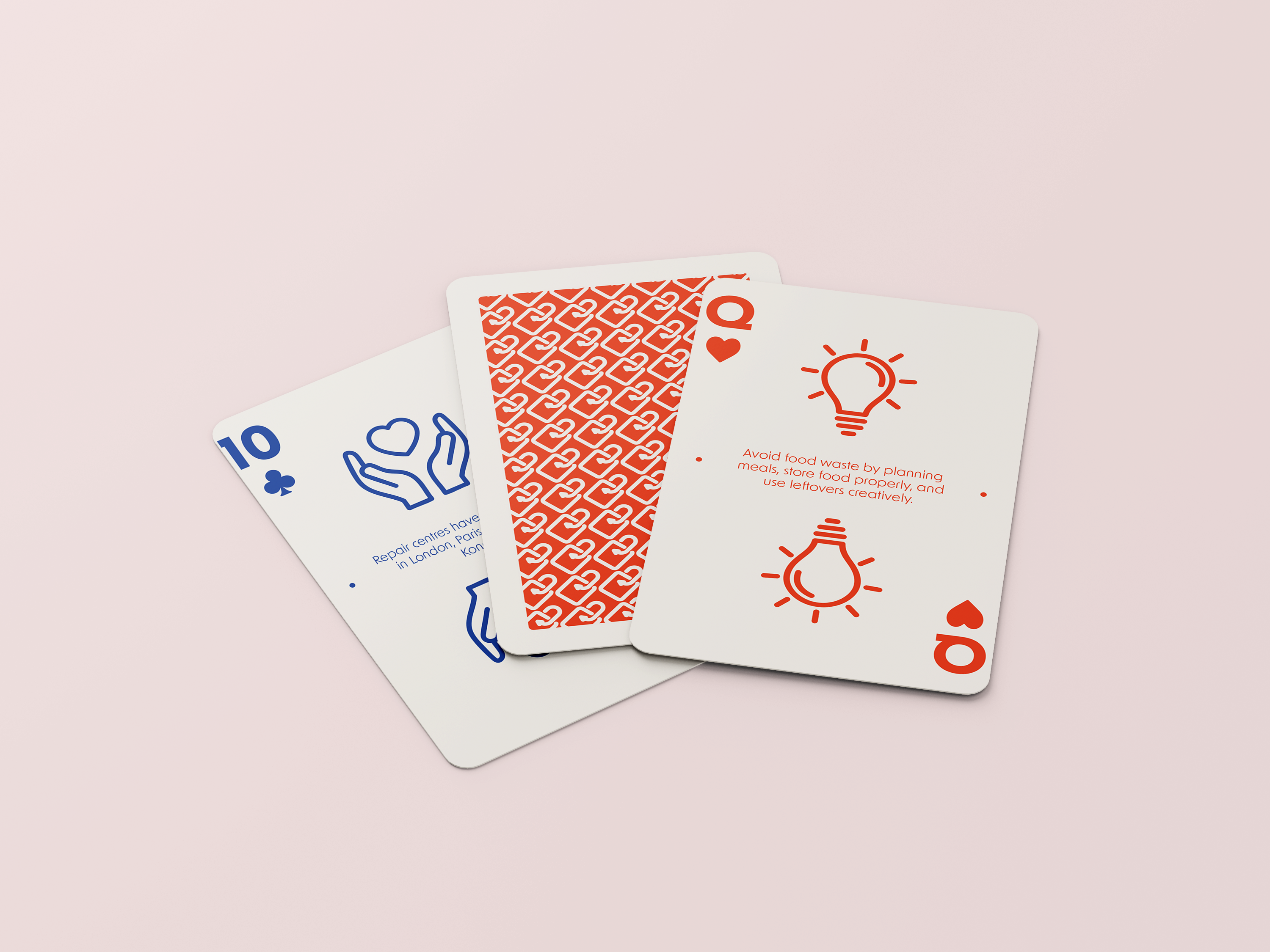
Branded Assets
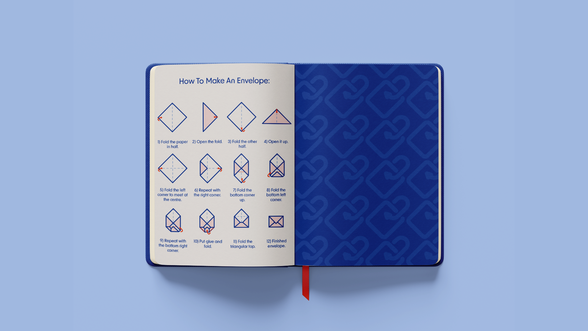
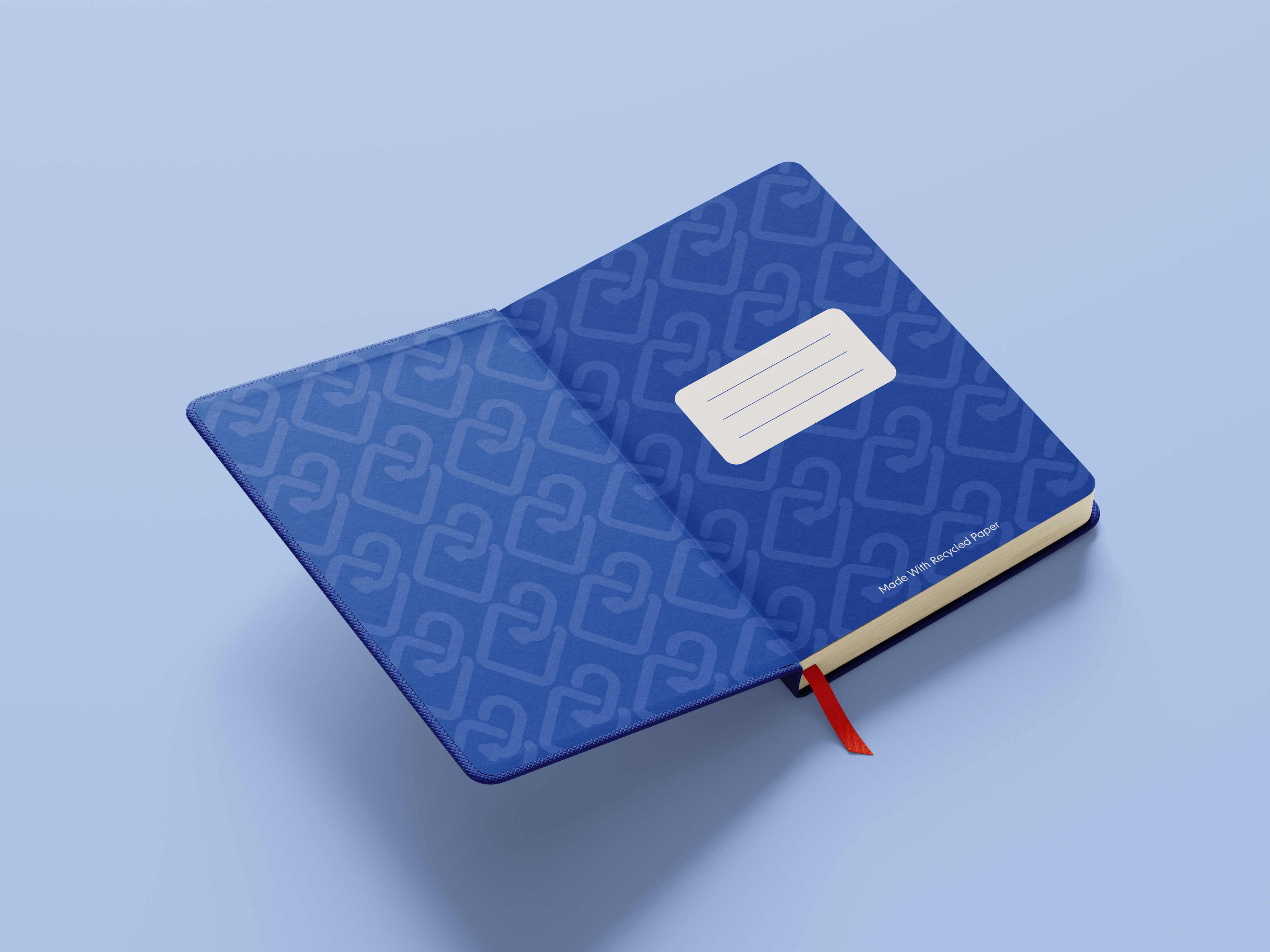
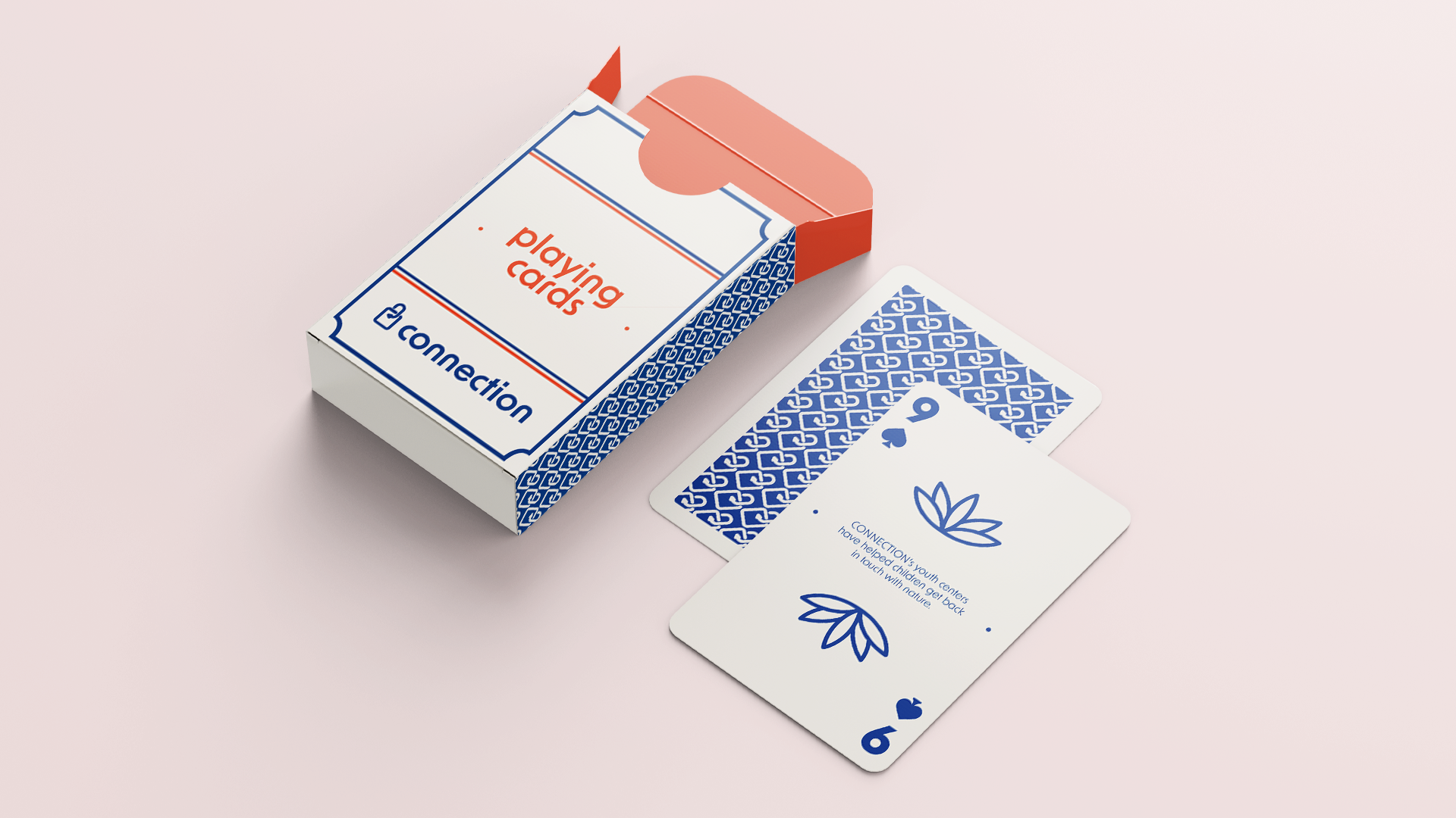
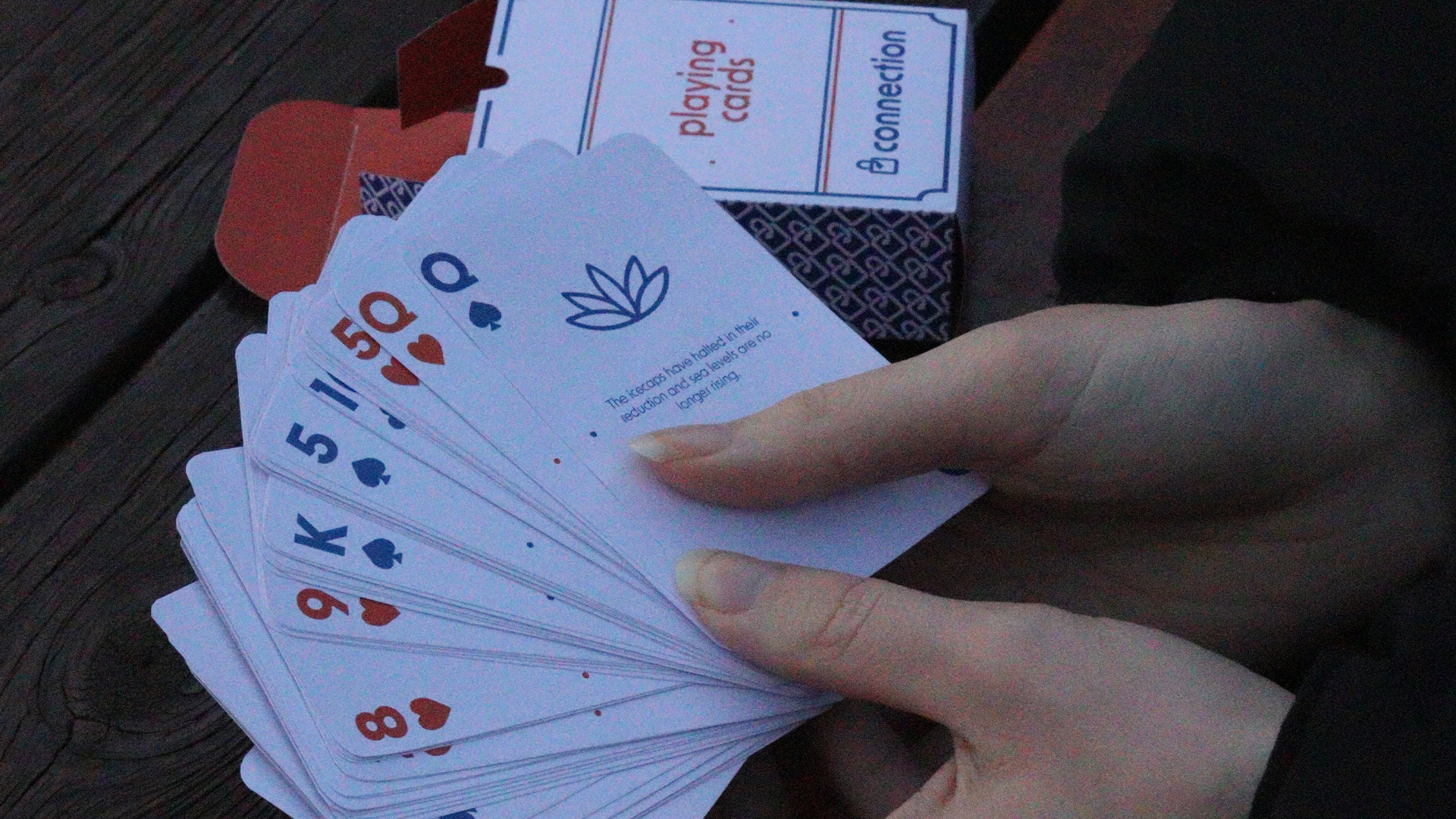
When beginning the branding process, we collaborated to divide tasks among ourselves. Within the toolkit, Holly and I worked on a few items. I created the notebook and designed the step-by-step guide for making an envelope, while Holly designed the initial layout for the cards and the card box. To save time and manage the workload, we divided the card suits among the group, with each of us designing 13 cards: Leah handled the clubs, Holly the spades, Eva the diamonds, and I the hearts.
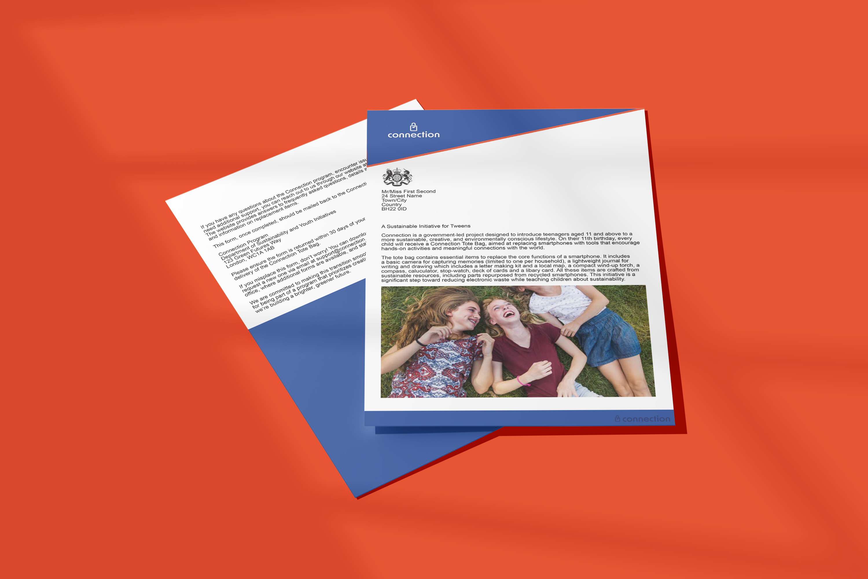
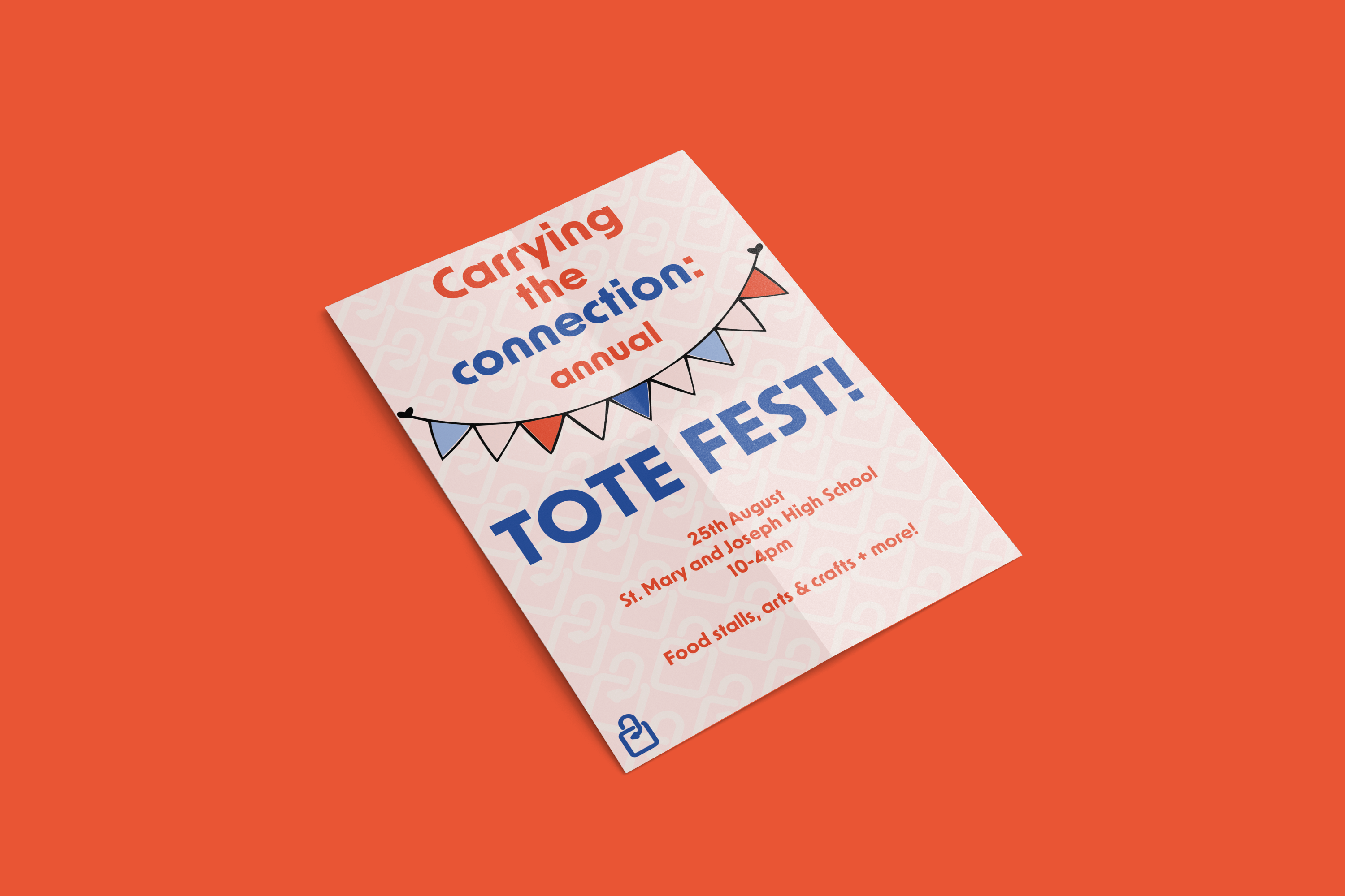
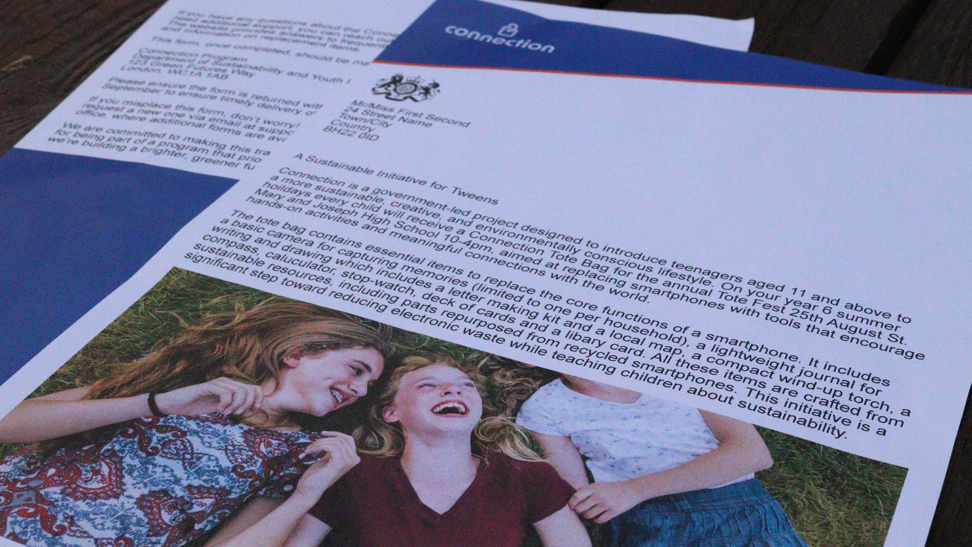
Additionally, Leah was responsible for designing the leaflet, which would be distributed in local areas and schools to promote the “Tote Fête,” where participants could decorate their toolkit bags. Finally, Eva’s role was to design the government letter, intended to be formal and informative.
The Final Outcome
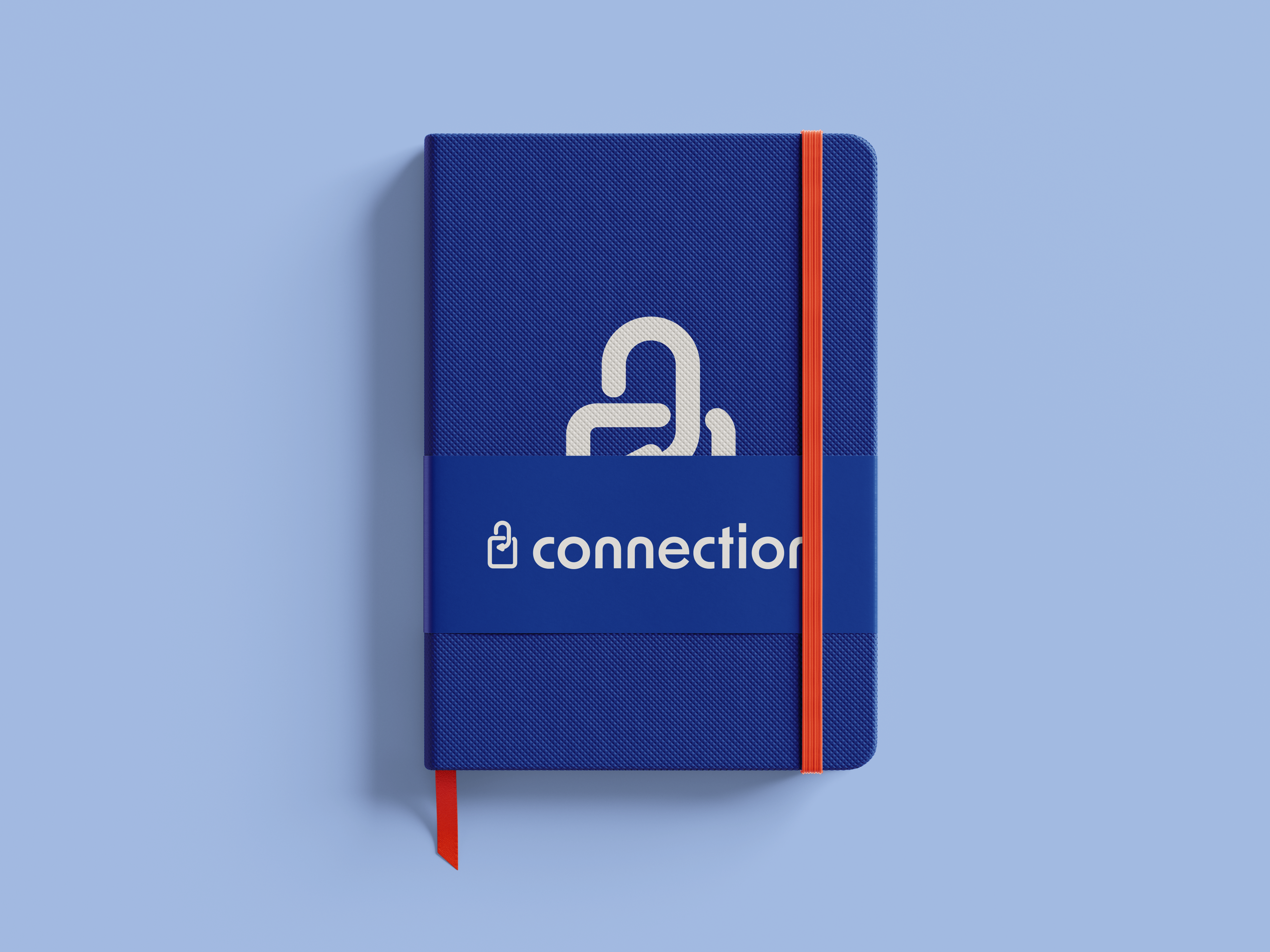
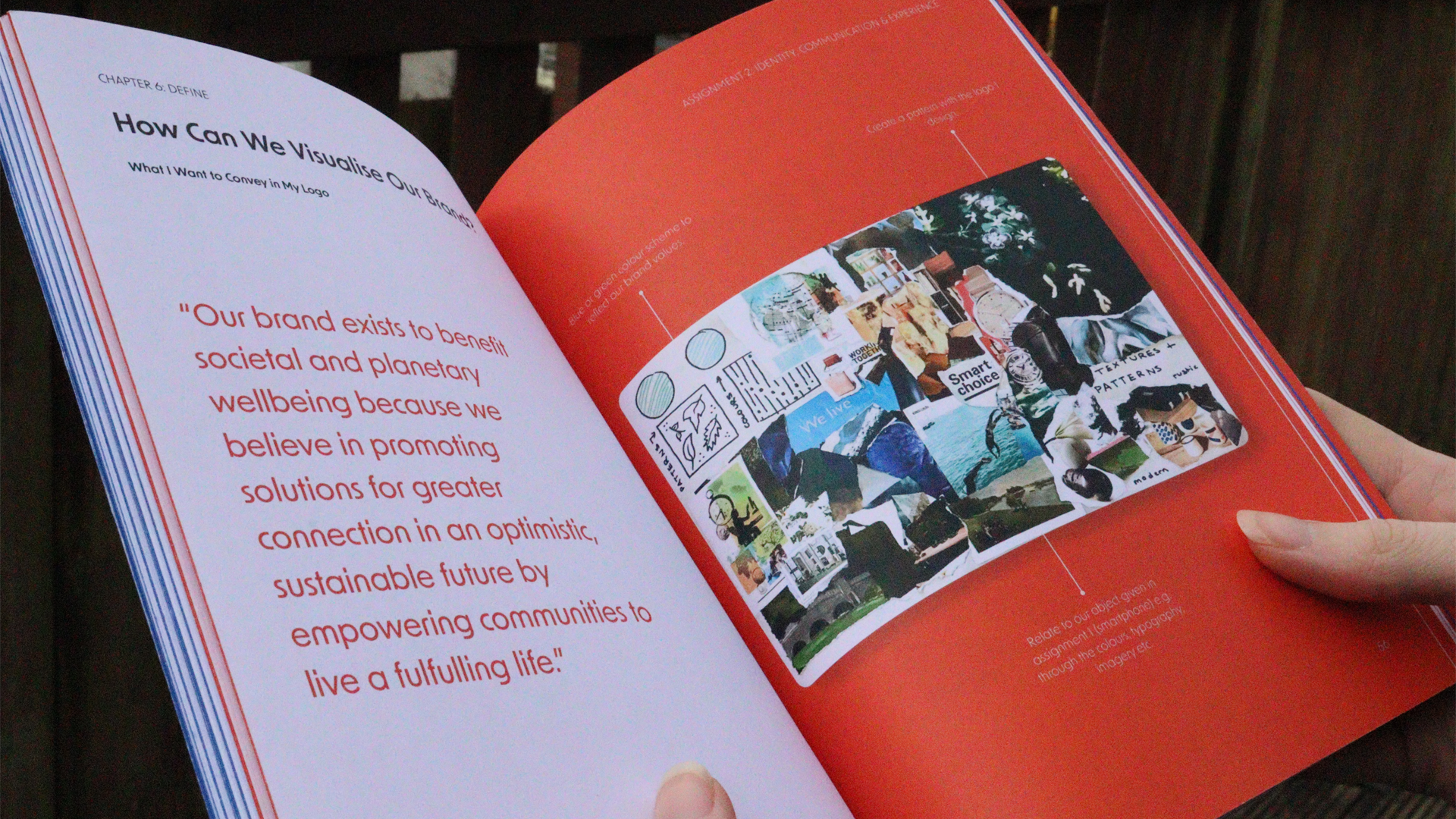
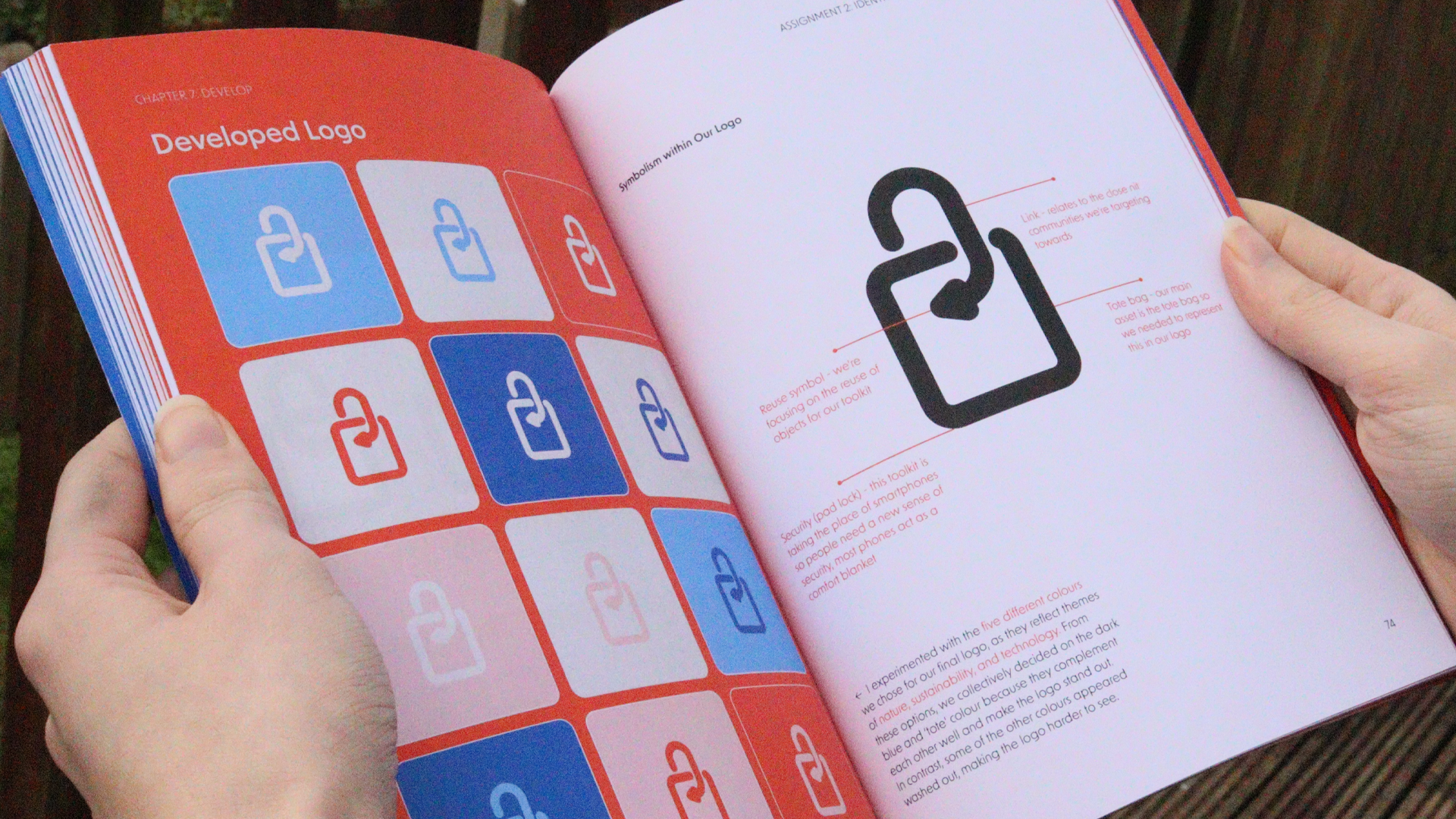
As part of our final outcome, we were tasked with designing a logo for our brand. When I began creating my sketches, I kept in mind what I wanted to represent or symbolise within them, aiming to give the logo a deeper meaning that resonates with both the brand and its audience. This approach helped me determine what would and wouldn’t work, as well as the style of illustration I wanted to pursue. I kept the designs simple, focusing on an outline style that could easily integrate with text.
What Steps Did We Take to Create Our Brand Identity?
The Impact
As part of this unit, we presented our final brand identity to the design experience agency Imagination. They praised the natural way we presented and appreciated the journey we took to reach our final outcome. They also highlighted how effectively we utilised our individual skills within the toolkit, which stood out to them. Each of us had a specific role and item to create, all tied to the bag concept.
The Final Outcome
Reflection
In the past, I’ve enjoyed branding projects but often struggled with initial ideas and sketches, which made me hesitant to see branding as one of my strengths. However, during this assignment, I found that I enjoyed designing logos and exploring colours and typography much more. This might be because I felt inspired and invested in our concept, which was our own creation. After designing our final logo, I now feel more motivated to continue working on logos and branding, whether for hypothetical or real-world projects.
Presenting to someone from Imagination three times now - in different settings such as a classroom, a video call, and a formal meeting room - has greatly influenced how I perceive receiving feedback, especially from professionals in the design field. This experience has been valuable not only when presenting our ideas but also when listening to the feedback given to other teams. It has encouraged me to see things from new perspectives and critique my own work in a more thoughtful way.