Image of a laptop with my website on the screen

Website Portfolio

Focus: Web Development, Coding, UX/UI

Software: BBEdit (HTML & CSS) Adobe Photoshop and Illustrator

How Does My Hand-Coded Website Portfolio Reflect My Design Process and Creative Identity?

Image of a laptop with my website and code on the screen

The Challenge

To immerse myself in the wonderful world of design, I needed to create a self-contained static website that showcased my design process and featured an ‘about me’ page. Considering I had never worked with code, aside from Scratch, this posed a new challenge: learning a completely new approach to design. This process allowed me to justify the features I wanted to include on my website while keeping the user in mind.

My website in Chrome
My landing page in Chrome
My website in Safari
My landing page in Safari, showing my favicon

The Process

In just four weeks, I began to understand and familiarise myself with HTML and CSS, hand-coded my website, and established my creative identity, all while considering who might visit my site, whether it would be my tutors, future employers, or portfolio viewers.

Sitemap & userflow
Sitemap showing how a user may navigate my website
Mind map for my 'About Me' page
Mind map exploring 'What make me unique?'

Sitemap & User Flow

Before I started coding my website, I needed to map out its layout, the content it would include, and how I intended users to navigate it. Initially, I planned to have three main navigation pages: the home/landing page, where my projects would also be displayed, an 'About Me' section, and a contact page. After familiarising myself with creating additional HTML files, I decided to challenge my coding skills further by adding an extra page, ‘Play,’ to showcase more of my design work. However, this page only features a hero image rather than the full design process, which can be viewed on my other social platforms.

What Should I Include in My 'About Me' Page?

After reviewing digital portfolios of existing designers, exploring design companies’ ‘About’ pages, and speaking with industry professionals, I gathered insights on aspects I liked and elements to avoid. For example, I chose not to display my name in large text, as it is already visible in other areas of my website - there’s no need for it to be front and centre. I also aimed to keep my content concise and avoided overused buzzwords like 'passionate,' 'creative,' and 'innovative.' Instead, I focused on expressing my personality through both my website’s design and my writing.

One website that inspired me was Beach Design Studio. Their ‘About’ page features images of their team members, which change to childhood photos when hovered over. This small detail made them feel more approachable and personal, an element I wanted to incorporate into my own website

Additionally, Battenhall visited us to discuss their work and website design. They emphasised the importance of showcasing personality by highlighting interests outside of design, which I found insightful since I hadn't initially considered this. I incorporated this idea through the short introductory sentences on my ‘About Me’ and landing pages, ensuring they are brief yet engaging, giving visitors a quick and meaningful summary of who I am.

Image of a laptop with my website and code on the screen
My 'About Me' page
Initial digital wireframes
Initial digital wireframes using Figma
Initial digital wireframe using Figma

Initial Digital Wireframes

When I first created my wireframes, I started digitally to better understand the scale of elements and plan out the images needed for each section. However, beginning this way limited my ability to fully map out the layouts and how the pages would link to each other. To gain more flexibility, I switched to sketching my wireframes, allowing me to label elements, colour code sections, and refine the structure more freely.

I knew I wanted my website to resemble the careers presentation I gave for my first project in my second year at university, as I felt it reflected my character well and resonated with me. When translating this concept digitally, I experimented with a similar cover design to maintain that connection.

Sketched wireframes
Sketched wireframes
Sketched home page wireframe
Sketched projects page wireframe
Sketched about me page wireframe

Sketched Wireframes

Throughout most of my wireframing process, I chose to keep everything centred, including the navigation bar and my wordmark, to enhance wayfinding. This design allows users to primarily scroll down without needing to move their mouse around to navigate to the next section. Additionally, centring the content ensures that it remains visible regardless of the device size.

Digital wireframes using Figma
Digital wireframe using Figma

Developed Digital Wireframes

After sketching my wireframes, I recreated them digitally to build a basic skeleton that would serve as a guide when I started coding. One of the challenges I faced was designing the project pages to showcase my design process. I wanted all my projects to follow a consistent layout, but I struggled with deciding how to structure them effectively. Using Figma helped me visualise the grid and how each image would align, but when it came to coding, the grid became essentially invisible, presenting another hurdle I had to adapt to.

Digital wireframes using Figma labelled
Digital wireframes using Figma broken down

The Final Outcome

Once I settled on a more consistent layout for my website, I began coding and exploring colours and typography that I felt represented me, reflected my design style, and remained user-friendly.

How Did My Design Choices Shape the Final Website?

My chosen typography and colours
My custom typeface
My custom typeface

Colour & Typography

When deciding on my colour palette and typography, I aimed to keep them consistent with my careers presentation from the previous unit and align with my existing portfolio, which uses a similar colour scheme and typeface. I began by narrowing down the colour options and selecting a similar typeface from Google Fonts. This led me to choose a sans-serif typeface to create a young, modern, and legible feel for my site, along with a maximum of five colours that follow a monochromatic scheme. This approach gives the site a refreshing look and, personally, makes me feel happy.

My Visual Identity

To give my website a more personal touch, I used my favourite colour (green) and created a custom wordmark with a typeface I designed myself. I made this typeface using a kitchen sponge and black ink, writing the alphabet in all caps. In addition to featuring it on my website, I also showcase it on my Instagram and Behance profiles.

My website with alternative background colour
My website with chosen background colour

Why Is This My Background Colour?

As mentioned earlier, my original colour palette included a yellow background, but I found it made the website feel overwhelming and drew attention away from the main focus, my work and writing. As a result, I experimented with other colours and settled on a more muted, subtle off-white, which complements the green well. This choice also avoids the harshness of stark white, which could be uncomfortable for some viewers.

Notes
Notes taken in one of our workshops to help me remember specific bits of code
Code
Separate CSS file for my projects
CSS grid
Learning how CSS grid works using 'Code Pen'
Grid
Understanding how grids work using Firefox Developer

Learning to Code

During the process of coding my website, we attended workshops that helped with grids, typography, images, and more. While these workshops took place, I made brief notes and bookmarked helpful websites such as W3Schools. I found these resources very beneficial, especially since some aspects of coding were confusing to me, such as how the grid is essentially invisible unless viewed in Firefox Developer Tools. However, using CodePen made more clear to me how the grid works with two-digit values and how to space them out. Once I became more familiar with this, I grew more comfortable and created a separate CSS file for the process of my projects to stay more organised.

Image of a laptop with my website and code on the screen
User testing
People testing my website without assistance from me with navigation
Rollover
Rollover effect when your mouse hovers over a project
Navigation
Navigation at the end of each of my projects

The Impact

User Testing

While coding my website, I had users test it, whether peers, tutors, or family, to gather feedback from people of different ages and experience levels. This helped me identify areas to improve, such as navigation and the size of text and images. Overall, I didn’t need to make many changes, as I consistently kept the user in mind and understood what makes a website easy to navigate.

Rollover

On two of the pages (the landing page with my ‘work’ and the ‘about’ page), I have added a rollover effect on the images. For my work, the rollover indicates the viewer to click on the project as when hovered over it the title pops up. Whereas on my about page, I use this feature in a different way as when you hover over the picture of me it changes to another photo that isn’t in black and white.

Navigation

In addition to the navigation bar at the top of the screen, I created another one at the bottom of all my project pages, allowing users to easily view and select another project. If they want to return to the top, I’ve included an arrow that can be clicked to scroll back up. Additionally, no matter where you are on the website, my name is always visible at the top of the main navigation bar. Clicking on it will always take you back to the landing page. Similarly, if they’re already on the work page, clicking 'Work' again will take them to my projects, in case they don't scroll down.

My website on a phone held portrait
My website on a phone viewed vertically
My website on a phone held vertically
My website on a phone viewed horizontally

How Does My Website Translate When Viewed On a Phone?

To set myself another challenge, I made my website accessible on smartphones as well. I thought this worked quite well, as my hero images were still easily visible. However, some of the text, particularly the body text, appeared quite small since you can't adjust it to your preference on a phone.

Image of a laptop with my website on the screen

The Final Outcome

Reflection

Having learned the basics of HTML and CSS, I now realise how much time, effort, and detail go into designing and hand-coding a website. At first, I was intimidated, as I had never coded anything from scratch and didn’t know where to start. However, by attending coding workshops and practising with FreeCodeCamp and W3Schools for support, I gradually learned how to navigate the software. This growing knowledge and understanding encouraged me to experiment more, which in turn made me feel more comfortable and allowed me to enjoy both coding and designing my portfolio website.

Although I became more confident with HTML and CSS, some features I added to my code could have been implemented in a more professional or technically correct way. As I continue refining my portfolio website after submission, I plan to further develop my work processes and add new projects to my 'Work' and 'Play' sections. I also aim to expand my skills by incorporating scripts such as JavaScript and adding more animations.

One feature I’d like to experiment with is a ‘sticky’ navigation bar. I initially tried implementing it but wasn’t satisfied with the outcome, as a box appeared around the navigation bar when scrolling, whereas I wanted just the text to remain at the top. Another idea I’d like to explore is animating my backgrounds. I originally intended for my lines to animate gradually as users scrolled, but after researching, I found that this is likely to require JavaScript.

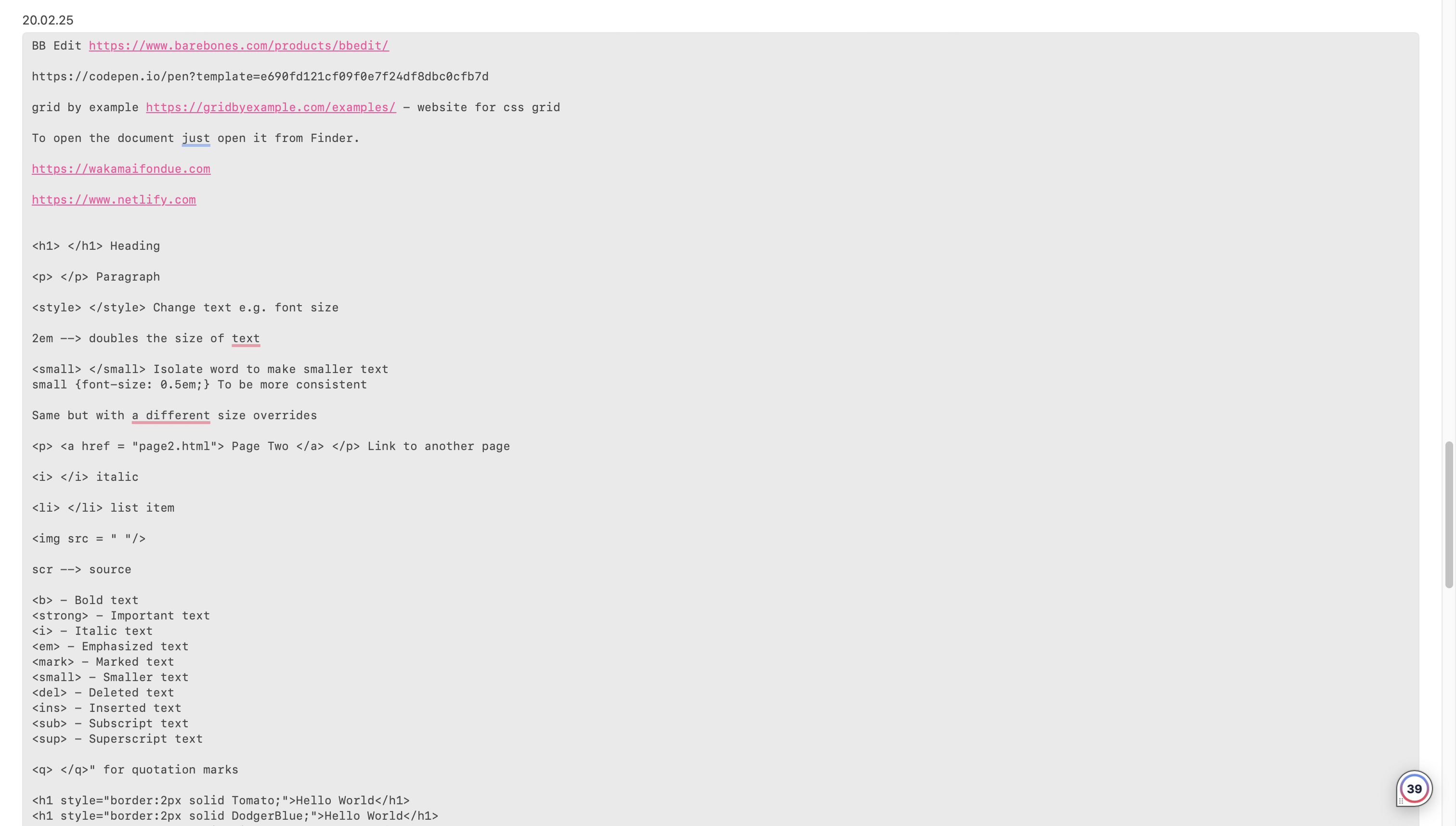
Codepen.io. (2017). Pure CSS Collapsible Sections without JavaScript. [online] Available at: https://codepen.io/markcaron/pen/RVvmaz?editors=1100 [Accessed 12 Mar. 2025].

Freepik. (2025). Iphone 14 Mockup Images - Free Download on Freepik. [online] Available at: https://www.freepik.com/free-photos-vectors/iphone-14-mockup [Accessed 12 Mar. 2025].

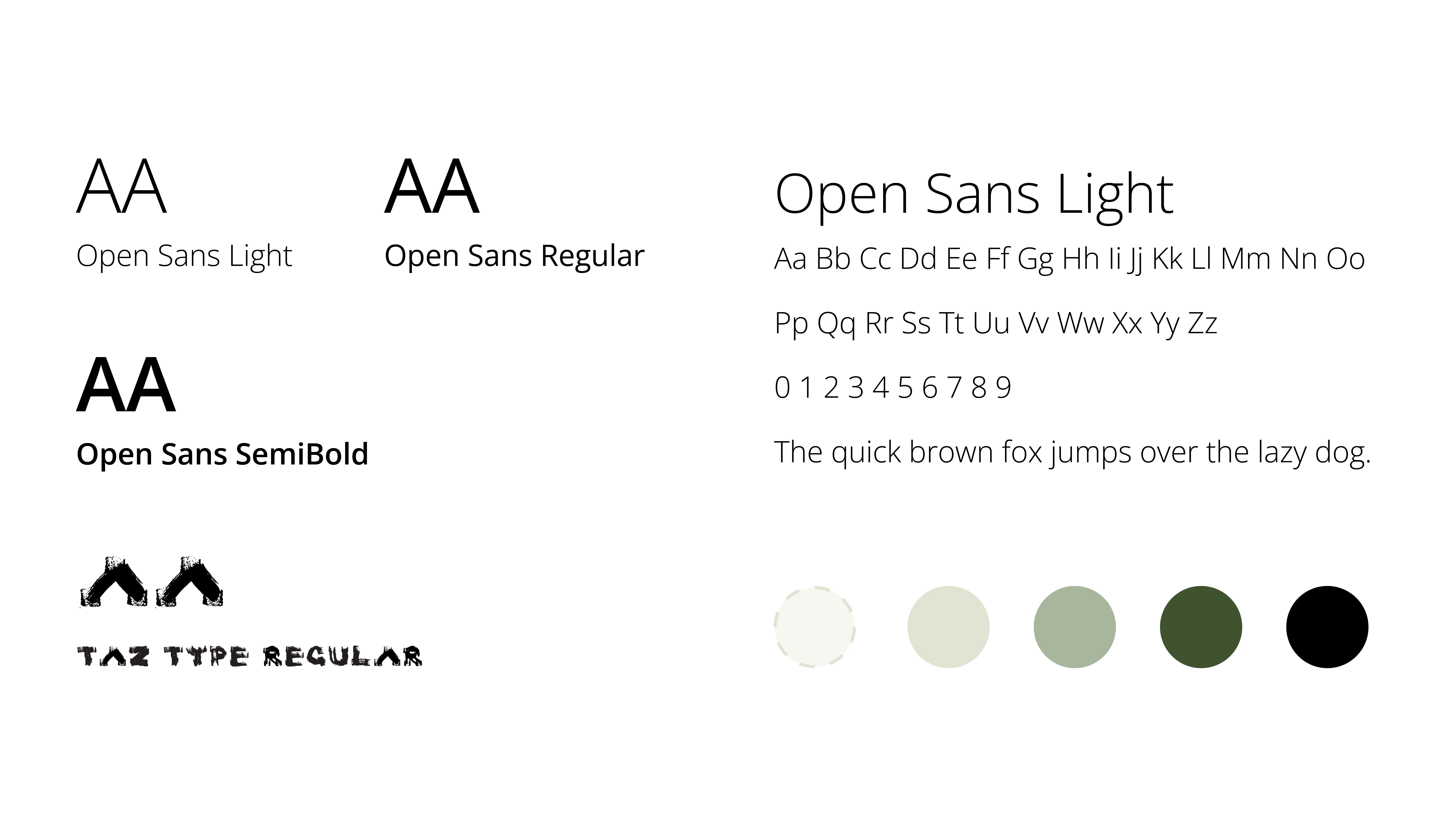
Google (2019). Google Fonts. [online] Google Fonts. Available at: https://fonts.google.com/specimen/Open+Sans.

gridbyexample.com. (n.d.). Grid by Example - Usage examples of CSS Grid Layout. [online] Available at: https://gridbyexample.com/examples/.

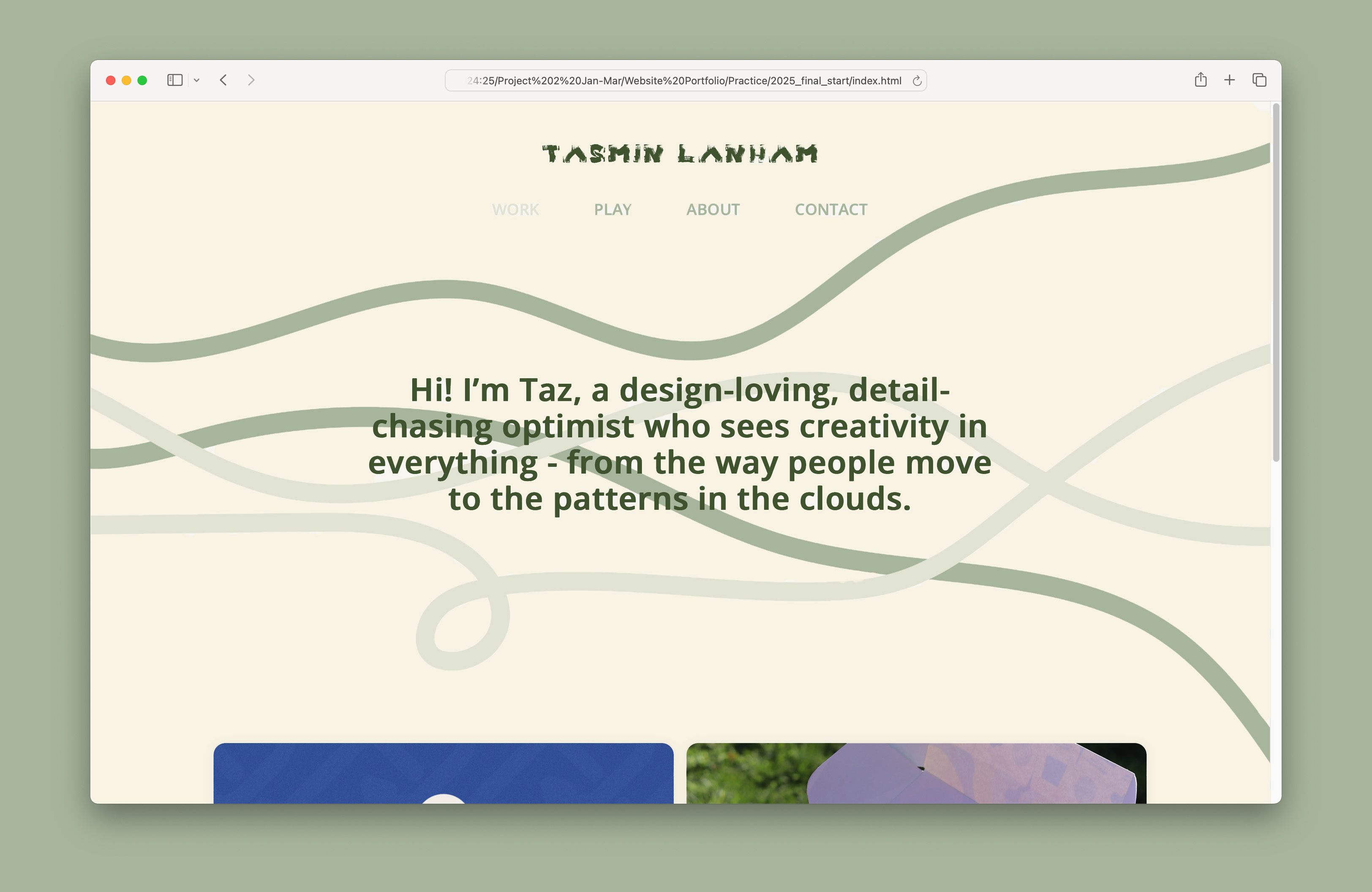
Netlify.com. (2025). Netlify. [online] Available at: https://app.netlify.com/teams/tasmin-lanham/sites [Accessed 12 Mar. 2025].

W3Schools (1999). W3Schools online web tutorials. [online] W3schools.com. Available at: https://www.w3schools.com/.

Wakamaifondue.com. (2025). Wakamai Fondue. [online] Available at: https://wakamaifondue.com/.

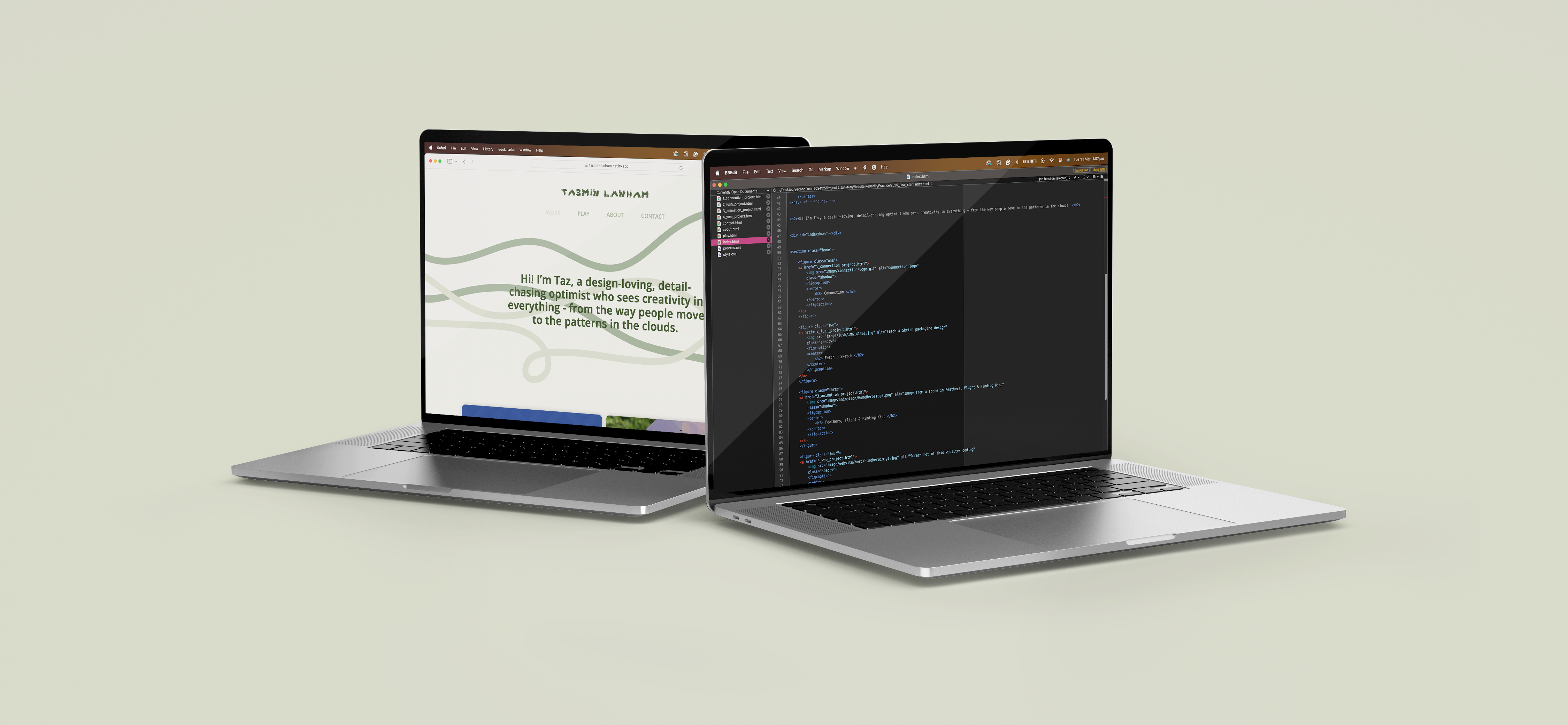
www.barebones.com. (n.d.). Bare Bones Software | BBEdit 13. [online] Available at: https://www.barebones.com/products/bbedit/.

www.freecodecamp.org. (n.d.). freeCodeCamp.org. [online] Available at: https://www.freecodecamp.org/learn/responsive-web-design/.